I like this photo because it is very simple, a picture of berries on a bush. However, the image is very sharp and the colors contrast greatly to create a strong center of interest.

I like this photo because it sums up my summers here in Bethesda: long days of sitting in a hammock, listening to summer sounds as the sun rises and then sets through the trees.

I like this photo because it is set in Norway, where I am from. I really liked the experience of building this fire and cooking at the edge of this fjord.

I dislike this photo because the subject is very blurry and the visual effect is boring. This picture doesn't make me feel anything, and I feel that all great pictures make the viewer feel or reflect on something.

I don't like this picture because it is of a stapler in front of some paper, possible the most boring combination of subject and background possible.

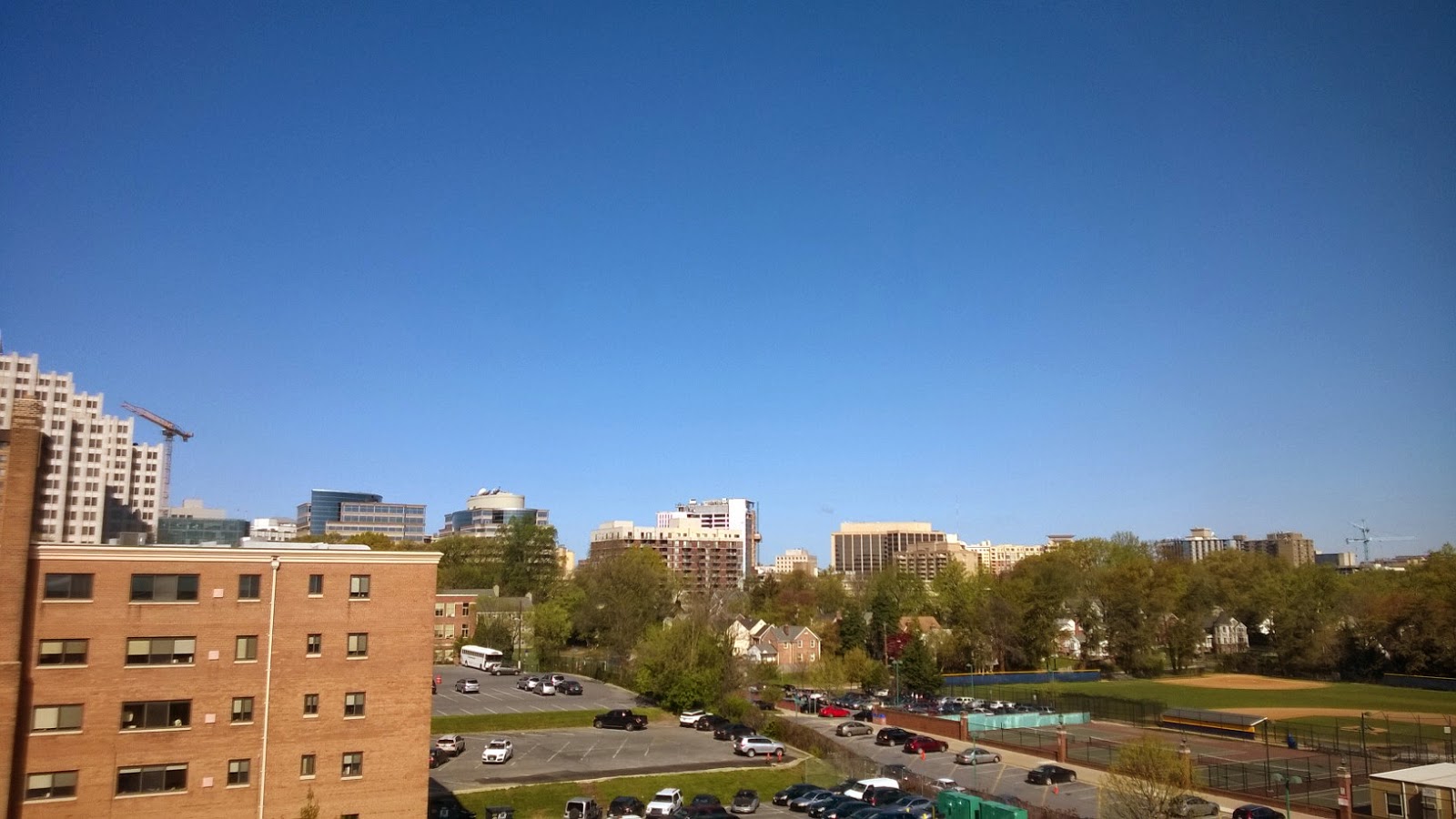
This landscape is not good because there is no clear subject; there is only green for a third and then bluish gray for a third of the photo. It is boring.